Master Responsive Design with Tailwind Max Width

tailwind max width
Frontend

In today’s digital world, responsive design isn’t just nice, it’s essential. People visit websites on all kinds of devices, so your site must look good everywhere. That’s where Tailwind CSS comes in. It’s a utility-first framework that makes responsive design easy. One of its best tools? The Tailwind max width utility. In this article, you’ll learn how to use Tailwind CSS max-width for responsive design. You’ll see examples, best practices, and tips to make your layouts work on any screen.

What is Tailwind CSS?

Tailwind CSS is a utility-first CSS framework. It lets you build custom designs right in your HTML. Instead of writing traditional CSS, you use pre-made classes to style elements. This keeps your code short, easy to maintain, and very flexible.

Key Features of Tailwind CSS:

  • Pre-made classes: Tailwind gives you lots of utility classes for things like margins and colors.
  • Highly flexible: You can change Tailwind’s default settings to match your project.
  • Responsive design: Tailwind helps you create layouts that work on all screen sizes.

Understanding Max Width in Responsive Design

What is Max Width?

In CSS, max width defines the maximum width an element can take. It’s a key tool in responsive design because it ensures your content doesn’t stretch too wide on larger screens, maintaining readability and layout consistency.

Why is Max Width Important?

Setting a max width helps:

  • Prevent content from overflowing on smaller screens.
  • Maintain a clean, readable layout across devices.
  • Ensure your design scales gracefully from mobile to desktop.

Common Challenges with Max Width

  • While max width is powerful, it can cause issues if not used correctly. For example:
  • Fixed max widths might look great on desktop but break on mobile.
  • Content might overflow if the max width isn’t responsive.

This is where Tailwind max width comes in handy. Its utility classes make it easy to set responsive max widths without breaking your layout.

Predefined Max-Width Classes

  • Tailwind offers several predefined max-width classes that can be used directly in your HTML:

Class Max Width

max-w-xs 20rem (320px)

max-w-sm 24rem (384px)

max-w-md 28rem (448px)

max-w-lg 32rem (512px)

max-w-xl 36rem (576px)

max-w-2xl 42rem (672px)

max-w-3xl 48rem (768px)

max-w-4xl 56rem (896px)

max-w-full 100% of parent

Using Tailwind Max Width Classes

Syntax Overview
Tailwind’s max width utility classes follow a simple naming convention:

  • max-w-full: Sets the element’s max width to 100%.
  • max-w-screen-md: Sets the max width to the medium screen size (768px by default).
  • max-w-7xl: Sets a custom max width (80rem by default).

These classes are responsive by default, meaning they adapt to different screen sizes.

Example Usage
Here’s a simple example of how to use Tailwind max width:

<div class=”max-w-md mx-auto mt-10 bg-white rounded-xl shadow-md p-4″>

  <!– Content Here –>

</div>

  • max-w-md sets the maximum width of the div to 28rem (448px by default).
  • mx-auto centers the div horizontally.
  • The result is a clean, centered container that looks great on all devices.

Responsive Design Strategies with Tailwind Max Width

Mobile-First Approach

Tailwind follows a mobile-first design philosophy. This means you start by designing for smaller screens and then scale up for larger ones. Using Tailwind max width classes, you can ensure your layouts are optimized for mobile first.

  • For example:

<div class=”max-w-full sm:max-w-md md:max-w-lg lg:max-w-xl”>

  <!– Content Here –>

</div>

Here:

  • On mobile (max-w-full), the div takes up the full width.
  • On larger screens, the max width increases (sm:max-w-md, md:max-w-lg, etc.).


Breakpoint-Based Design
Tailwind provides predefined breakpoints (sm, md, lg, xl, 2xl) that you can use with max width classes. This makes it easy to create responsive designs that adapt to different screen sizes.

Example:

<div class=”max-w-full sm:max-w-md md:max-w-lg lg:max-w-xl”>

  <!– Content Here –>

</div>

In this example:

  • The div’s max width changes at each breakpoint, ensuring a responsive layout.

Customizing Breakpoints

If Tailwind’s default breakpoints don’t fit your needs, you can customize them in the tailwind.config.js file. Here’s how:

module.exports = {

  theme: {

    screens: {

      ‘xs’: ‘320px’,

      ‘sm’: ‘640px’,

      // Add custom breakpoints here

    },

  },

}

  • This lets you define breakpoints that match your project’s requirements.

Best Practices for Responsive Design with Tailwind Max Width

Consistency Across Devices

To maintain a consistent layout across devices:

  • Use Tailwind max width classes to prevent content overflow.
  • Test your design on multiple screen sizes to ensure it looks great everywhere.


Flexibility and Adaptability

Make your layouts flexible by combining Tailwind max width with other utility classes. For example:

<div class=”flex flex-wrap justify-center”>

  <div class=”max-w-md mx-4 my-4″>

    <!– Content Here –>

  </div>

</div>

Here:

  • flex and flex-wrap create a flexible layout.
  • max-w-md ensures each item has a consistent max width.

Real-World Examples and Case Studies

Example 1: Responsive Blog Layout

Imagine you’re building a blog. Using Tailwind CSS max width, you can create a responsive layout that adapts to different screen sizes:

<div class=”max-w-4xl mx-auto p-4″>

  <h1 class=”text-3xl font-bold”>Blog Title</h1>

  <p class=”mt-4″>Blog content goes here…</p>

</div>

Here:

  • max-w-4xl ensures the blog content doesn’t stretch too wide on larger screens.
  • mx-auto centers the content horizontally.

Example 2: E-Commerce Product Page

For an e-commerce product page, you can use Tailwind max width to create an adaptive layout:

<div class=”max-w-full sm:max-w-md md:max-w-lg lg:max-w-xl”>

  <img src=”product.jpg” alt=”Product” class=”w-full”>

  <h2 class=”text-xl font-bold mt-4″>Product Name</h2>

  <p class=”mt-2″>Product description…</p>

</div>

  • The product card’s max width changes at each breakpoint, ensuring it looks great on all devices.

In summary

Mastering responsive design with Tailwind CSS max-width is a big win for modern web development. Using Tailwind’s utility classes, you can build flexible layouts that work well on any screen. Whether you’re making a blog, an online store, or something else, Tailwind max-width helps you keep your design responsive and consistent.

Want to improve your skills? Try Tailwind’s utility classes and dive into its advanced features. With Tailwind CSS max-width, you’ve got endless options.

Tailwind CSS Max-Width FAQs

What is Tailwind CSS max width?

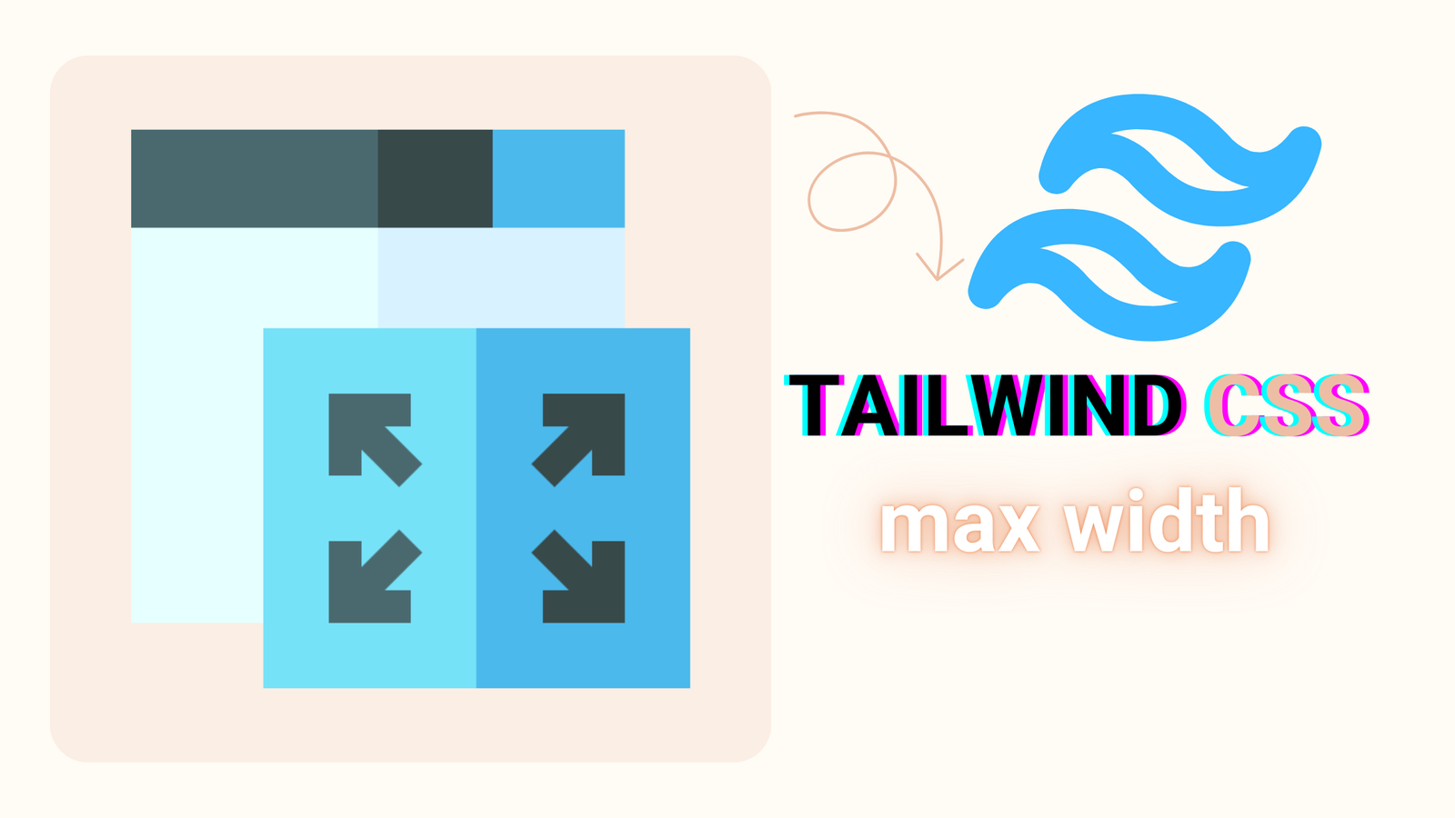
Tailwind CSS max width refers to utility classes like max-w-full, max-w-md, and max-w-screen-lg that allow you to set the maximum width of an element. These classes help create responsive designs by ensuring content doesn’t stretch too wide on larger screens.

What are Tailwind’s default max width values?

Tailwind provides predefined max width values, such as: max-w-xs: 20rem (320px) max-w-sm: 24rem (384px) max-w-md: 28rem (448px) max-w-lg: 32rem (512px) max-w-xl: 36rem (576px) max-w-full: 100%

Why is Tailwind max width not working?

If Tailwind max width isn’t working, check for: Typos in class names (like max-w-md instead of max-w-m). Missing or conflicting CSS rules. Improper Tailwind configuration in tailwind.config.js.

What’s the difference between max width and width in Tailwind?

Width (w-*): Sets a fixed width for an element (like w-64 for 16rem). Max Width (max-w-*): Sets the maximum width an element can take, allowing it to shrink on smaller screens.

Leave a Reply

Your email address will not be published. Required fields are marked *